Piece 1: Documentation
Visualization 1: Dot Chart
I wanted to compare prices at the NYUAD Convenience Store with those at nearby grocery regions. Usually to compare quantities, one would do a grouped column chart where each group would represent a product and each bar could represent a different grocery brand. However, given the large sample size and the need to compare across groups, I found myself sketching a dot chart when brainstorming.
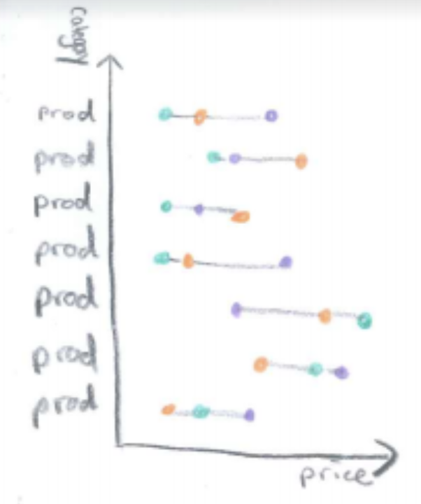
I showed the sketches to an editor at The Gazelle when discussing how to represent these prices and got good feedback.
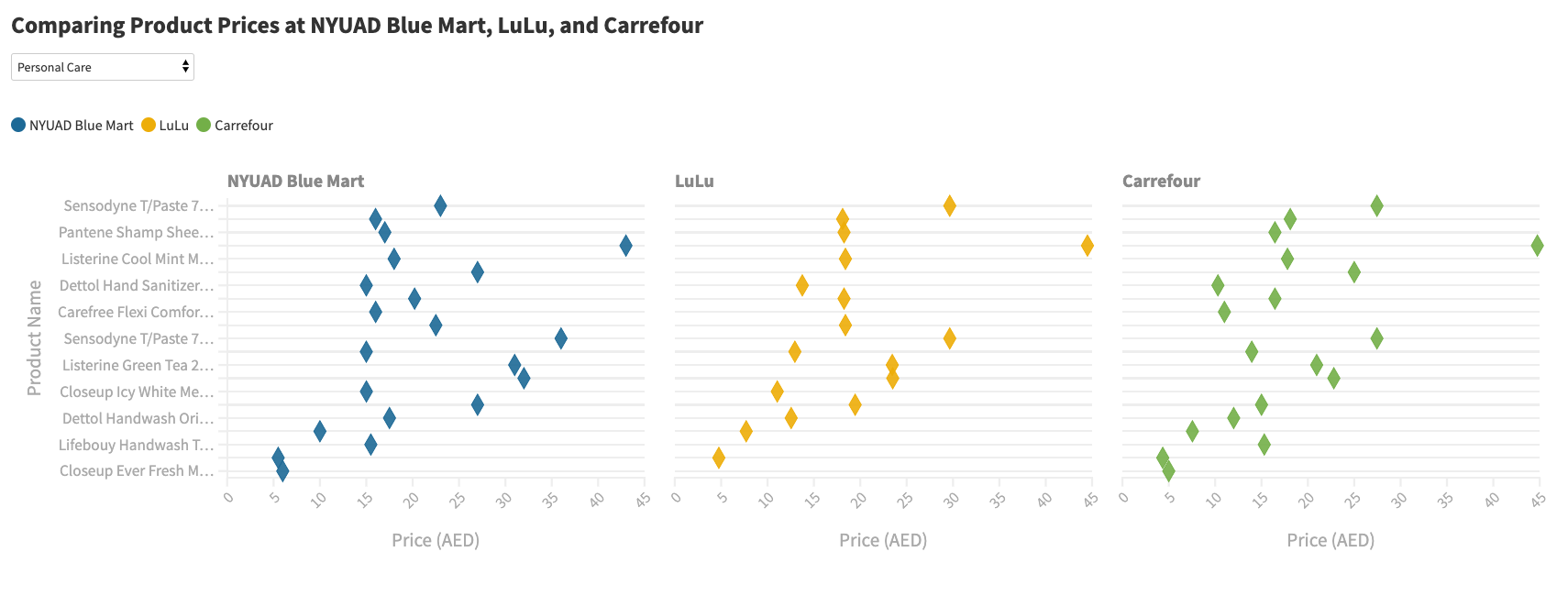
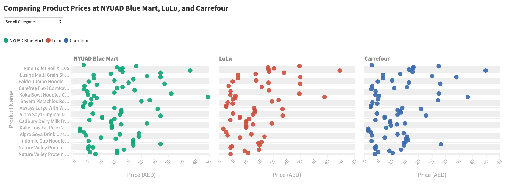
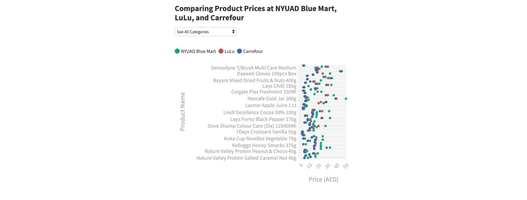
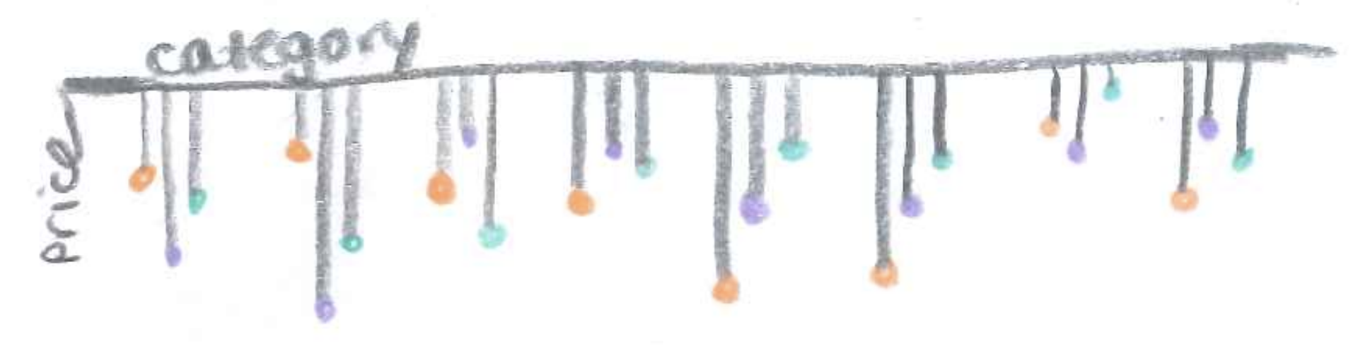
I wanted to change the colors to match the brands' colors for easier association. I didn't really like the grid of charts...hard to convey comparisons. These hi-fi sketches also made me realize that I could not realistically display all 82 products, thus prompting me to create categories for the products to split them in the visualization. I used Coolors.co to make sure that the visualization colors looked distinct for different types of visual abilities.
Visualization 2: Population Pyramid
How much of the NYUAD Convenience Store prices are greater than another grocery brand? To explore this, I calculated the percent difference and wanted to visualize the distribution to see the range.
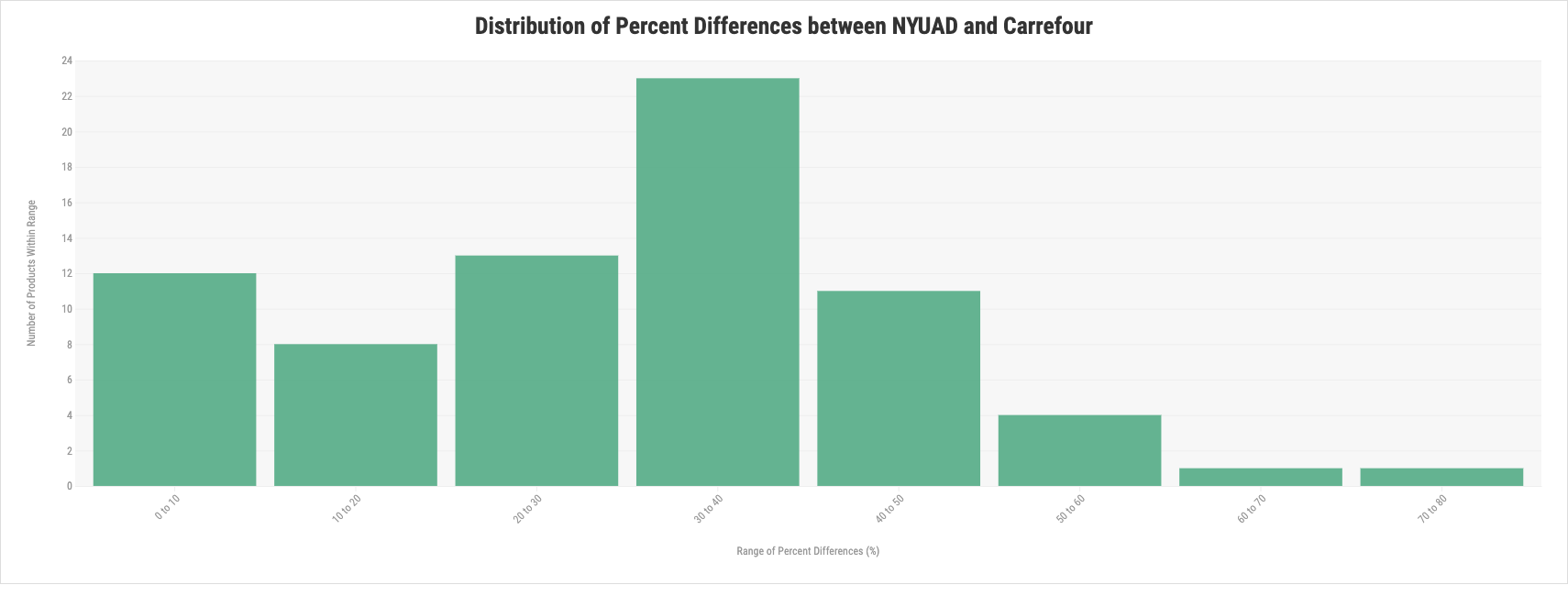
Though this vertical histogram was intuitive and more clear, it erased the direction of the percent difference and thus the few products that were actually cheaper at the NYUAD Convenience Store. I decided to do a population pyramid instead to show the direction of the percent difference.
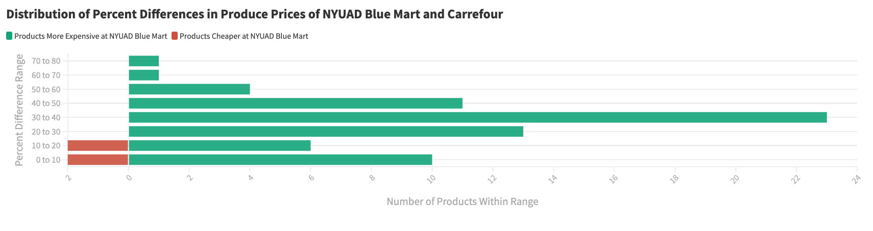
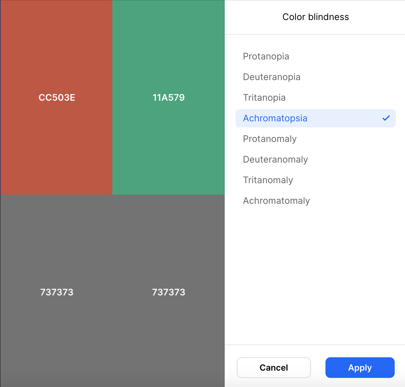
In color testing, the red and green palette failed for achromatopsia. Thus, I switched to a yellow/green palette.
Visualization 3: Dot Chart with Line
This was fairly straightforward to build out since I experimented with the another dot chart earlier. Since I wanted to show the difference between the two entities I was comparing, I added lines to show the difference between the dots. I kept the NYUAD purple color for our campus convenience store but added a new color for the new entity: other Blue Mart chains. Color testing passed.
Shopping Cart Game
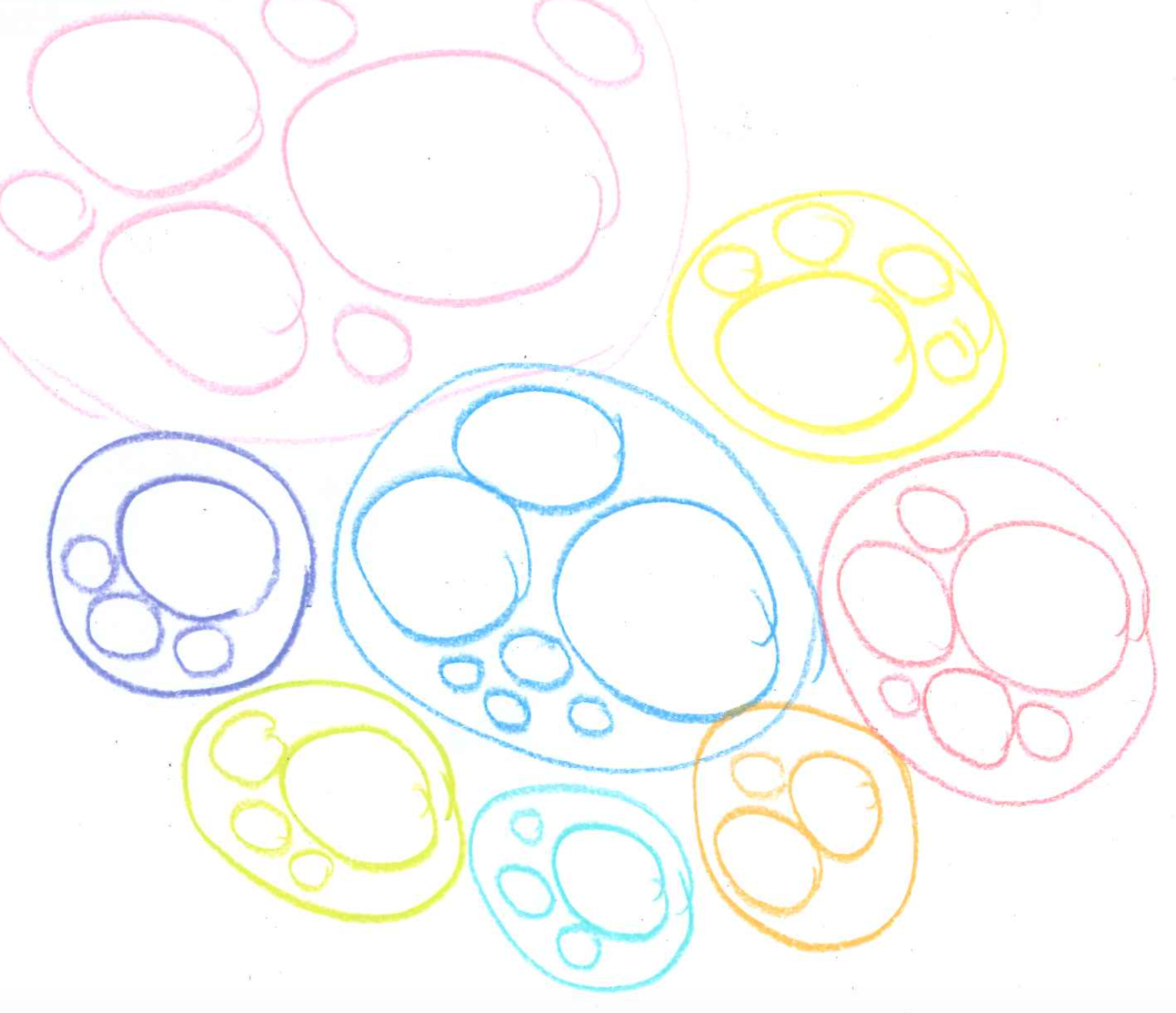
I wanted to build a game that would mimic the experience of shopping at the NYUAD Convenience Store and the ensueing financial loss. Here are a couple of my initial sketches.
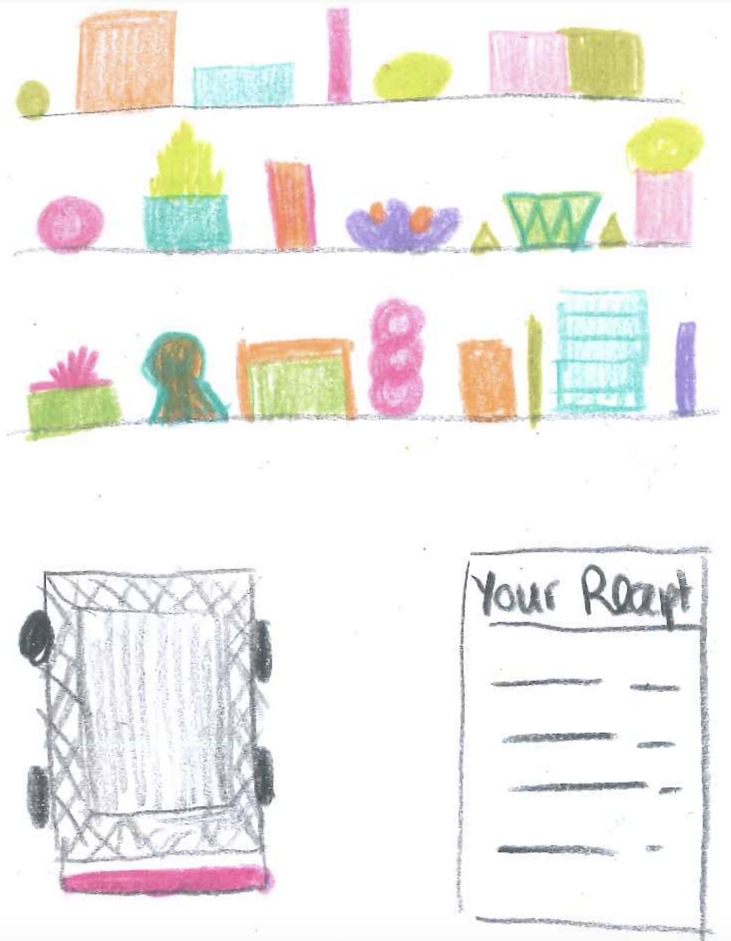
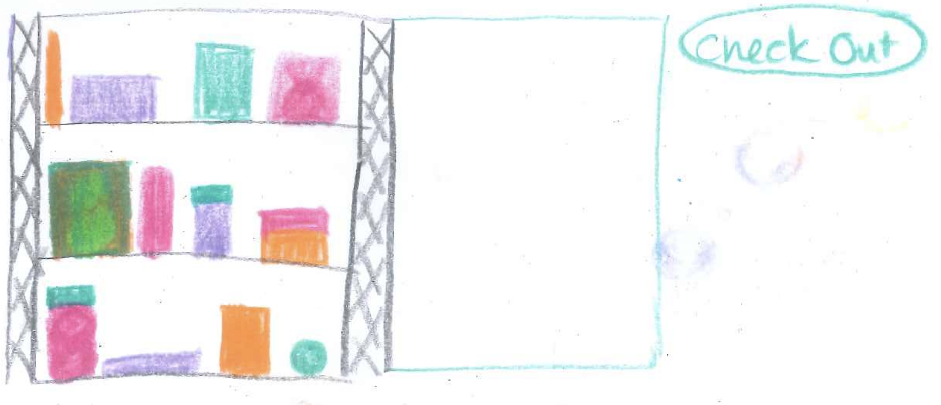
For the specific user interaction, I wanted to do drag and drop but also wanted to make it mobile compatible. Given the quick turnaround time of publishing, I didn't want to do two separate coding approaches for mobile vs desktop. Thus, I decided to make it clickable. In user testing, most people found the clicking intuitive, though one person said they'd prefer drag and drop. I added an instruction at the top to "click on a product to add to shopping cart." After showing the next iteration to a couple of students, one person suggested having the receipt section also give you the amount that a campus dirham is worth in terms of actual dirhams. I also tested the experience on various devices.
Piece 2: Documentation
Visualization 1: Bar Graph
I struggled with labelling the legend on this...one group is cross-listings only from other divisions and one group is all cross-listings. Color testing was successful for this palette.
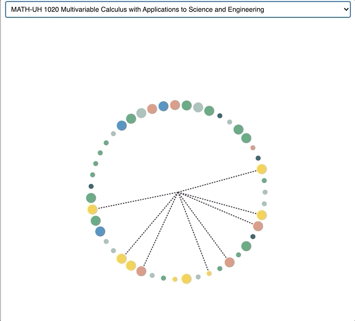
Visualization 2: Sunburst Diagram
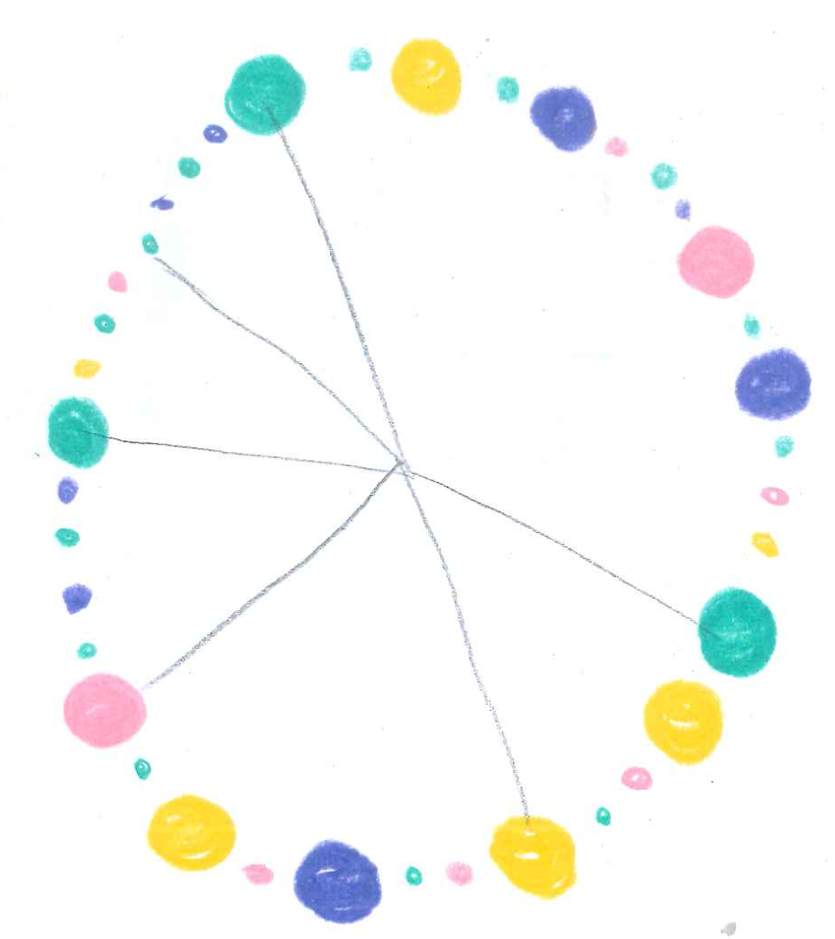
I originally imagined doing some sort of arc diagram connecting courses with their cross-listings. Here are my sketches imagining what that could look like. These sketches were inspired by one of my favorite data visualization designers, Federica Fragapane.
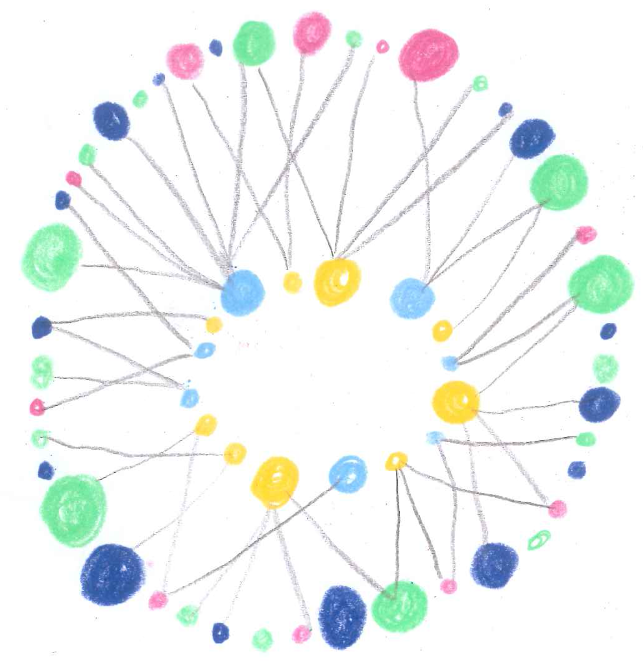
Eventually, I realized that the arc diagram just wouldn't work given the large sample size. I liked the radial aspect of one of the sketches and thought having a radial visualization would be well-suited for the large number of courses needed to visualize. I found myself sketching something radial but more hierarchical...a sunburst diagram! The first level could be the major, second level the courses, and the third level could be the cross-listings.
In user testing, people seemed to look for their own major first before exploring the rest of the visualization. I ended up adding a filter to the visualization so that people could immediately find what they were looking for. Users spent over 5 minutes on this visualization during user testing.
Visualization 3: Violin Plot
In this visualization, I wanted to show the distribution of the number of cross-listings in courses within a major but also compare that distribution to other majors. Thus, I was thinking of a beeswarm plot.
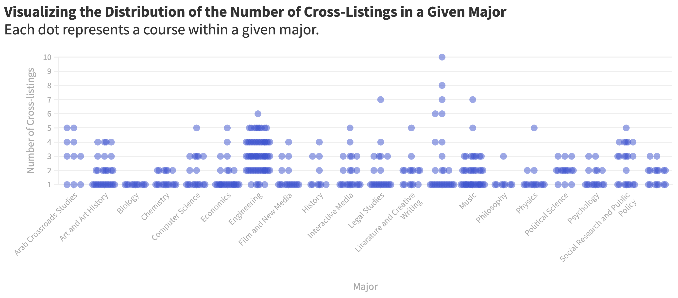
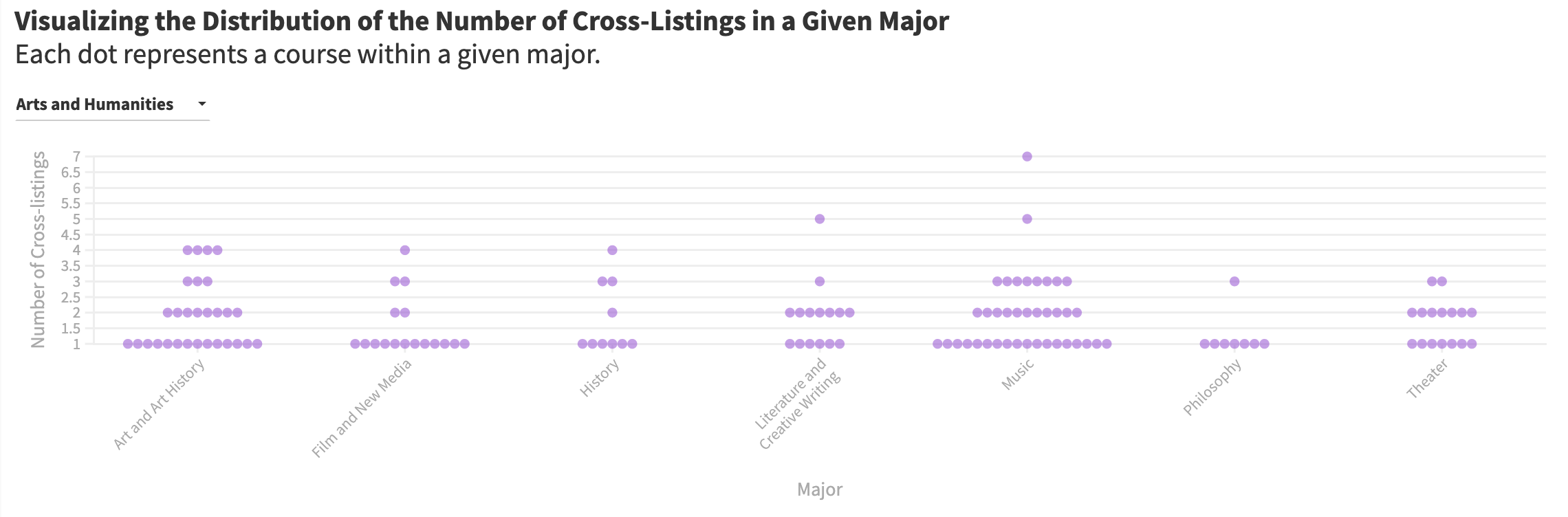
I realized that it would be more clear to have a filter by division just so the axis didn't get overcrowded. I realized that I also wanted to show the distribution, thinking that a violin plot might be more conducive
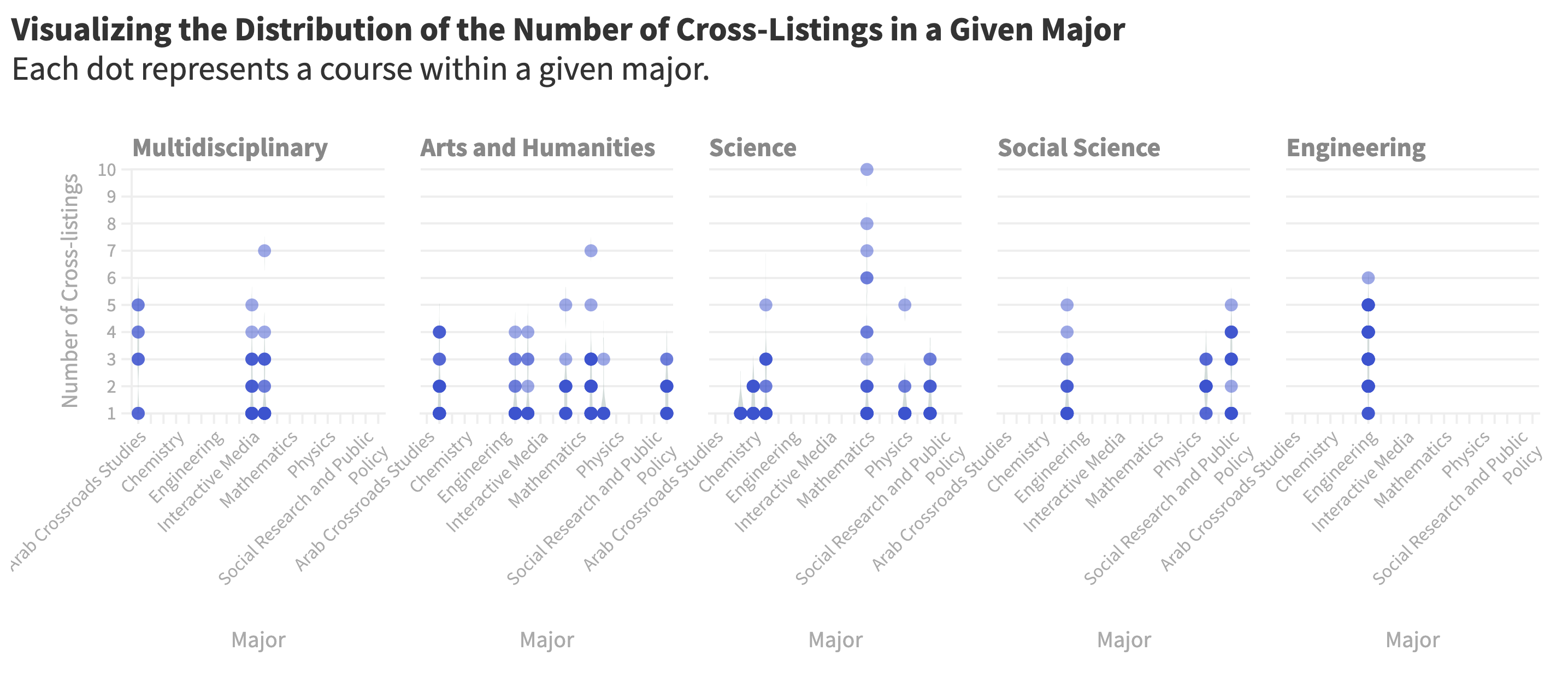
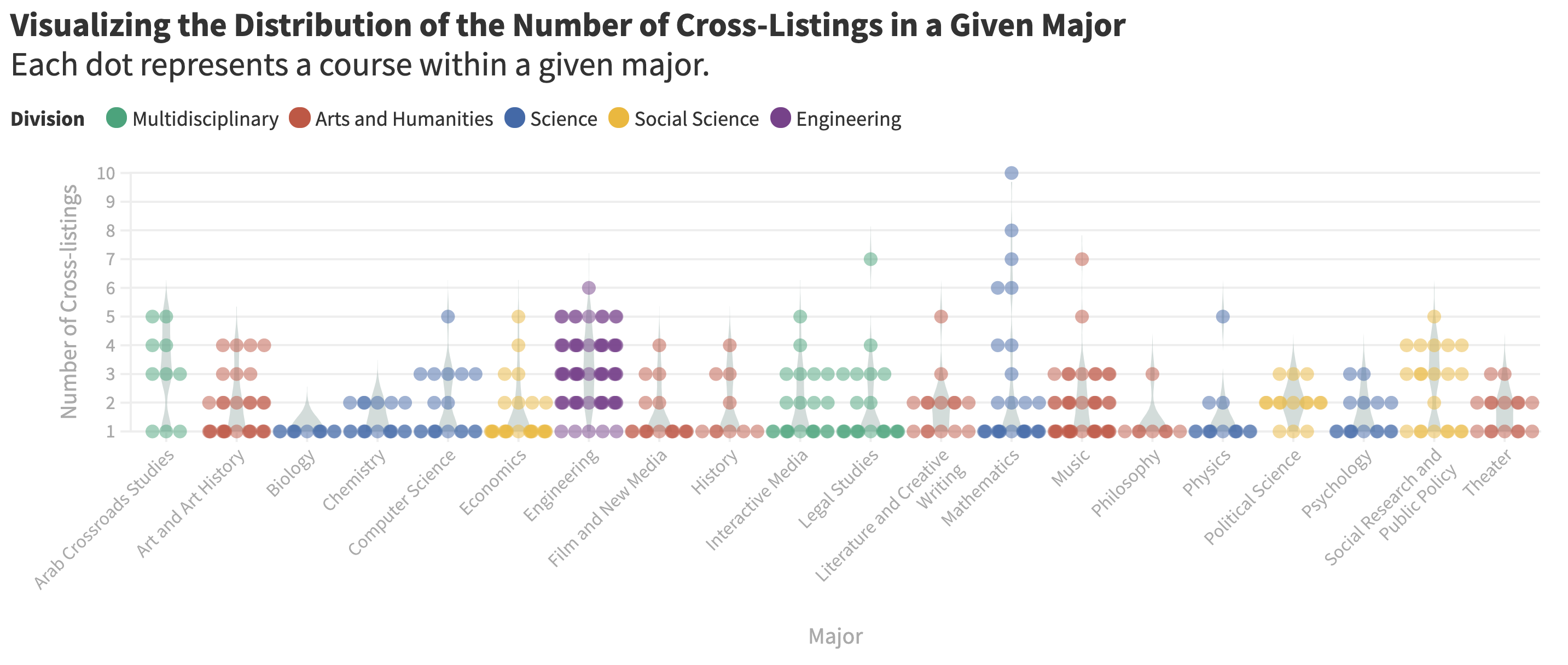
I thought that the violin plot was more intuitive than the beeswarm but wanted to filter by division to allow for more in-depth analysis given the limited space when publishing in The Gazelle (the width of a graphic is about 50% of window size). Thus, as nice as it would be to have every major on the same axis for comparison, it wasn't feasible without creating the plots on top of each other/being buggy. I ended up also overlaying the box plot to see the quartile range of the distribution. I played around with colors until I found a palette that was accessible.
Visualization 4: Modified Chord Diagram
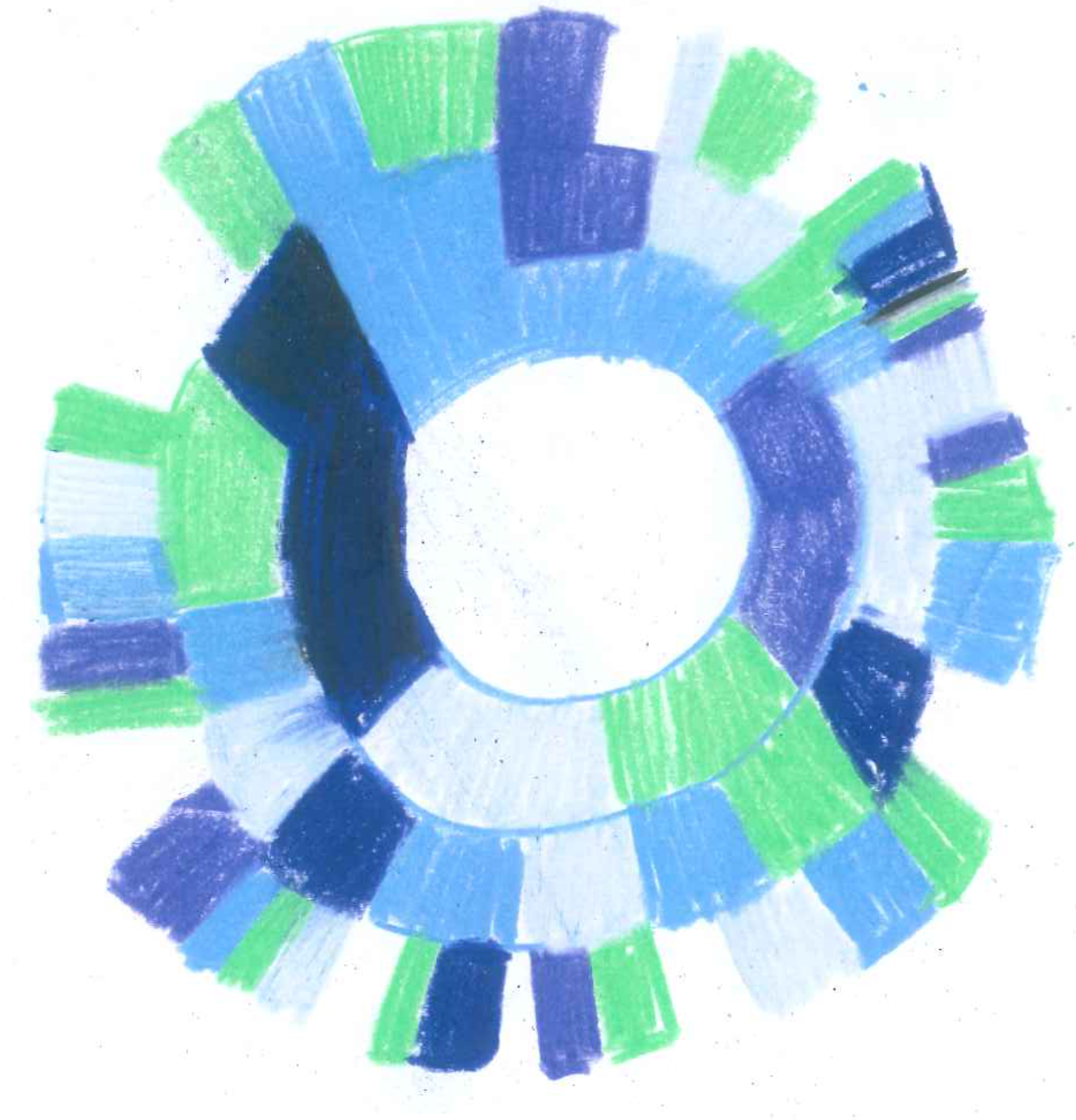
I wanted to show the most flexible courses defined as having the most cross-listings. I really liked the arc diagrams I sketched and thought they would be more suitable for this subset given the small sample size. I ended up keeping the radial theme, imagining a grid of circular visualizations. However, given the size of the publication's graphics, I decided to just show one at a time. This graphic was built in D3.js and given that I couldn't embed it directly into the publication's website, I ended up builidng it in a third party host (Glitch) and embedding that iframe. To encourage examination of individual elements in nonlinear storytelling style, I added tooltips to reveal the majors/minors/core of the cross-listings.
Code can be found here
Piece 3: Documentation
Visualization 1: Chloropleth Map
I wanted to start with the geographic distribution of the degrees to show the concentration of institutions from the Global North and start broadly. One thing I questioned was whether to make the legend scale esponsive depending on the subset examined. For instance, should the scale change depending on what is clicked on the filter, allowing for more specific insight by section? I decided to keep the visualization with the same maximum regardless of the subset examined just for accuracy in comparison.
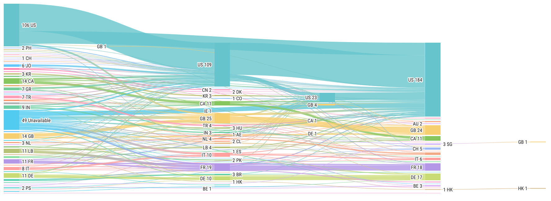
Visualization 2: Multi-step Alluvial
I wanted to show the flow between countries at different levels of institutions, thinking that a type of sankey diagram would be perfect to show this! The first iteration made me realize that there were just too many institutions to represent, thus I decided to divide by academic division. Additionally, there was one floating step at the end, representing a second PhD. I decided to combine the second PhD with the PhD level, creating a new entry between Master's and PhD to represent the path of the second PhD.
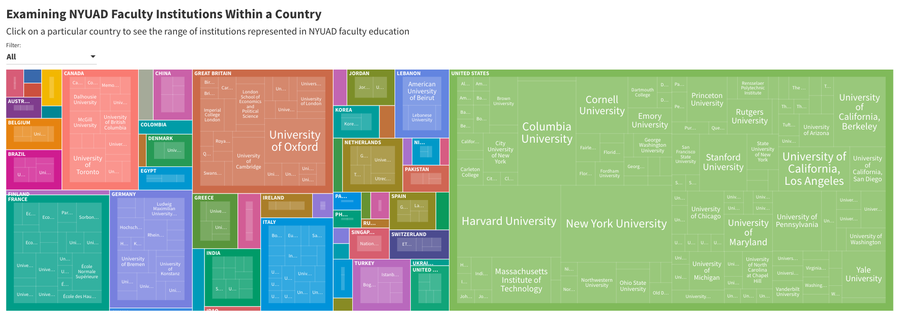
Visualization 3: Hierarchical Tree Map
I wanted this visualization to acknowledge the diversity of institutions within a country. Thus, I first imagined doing a proportional area chart to show how much the top institution(s) made up all the institutions represented in a country.
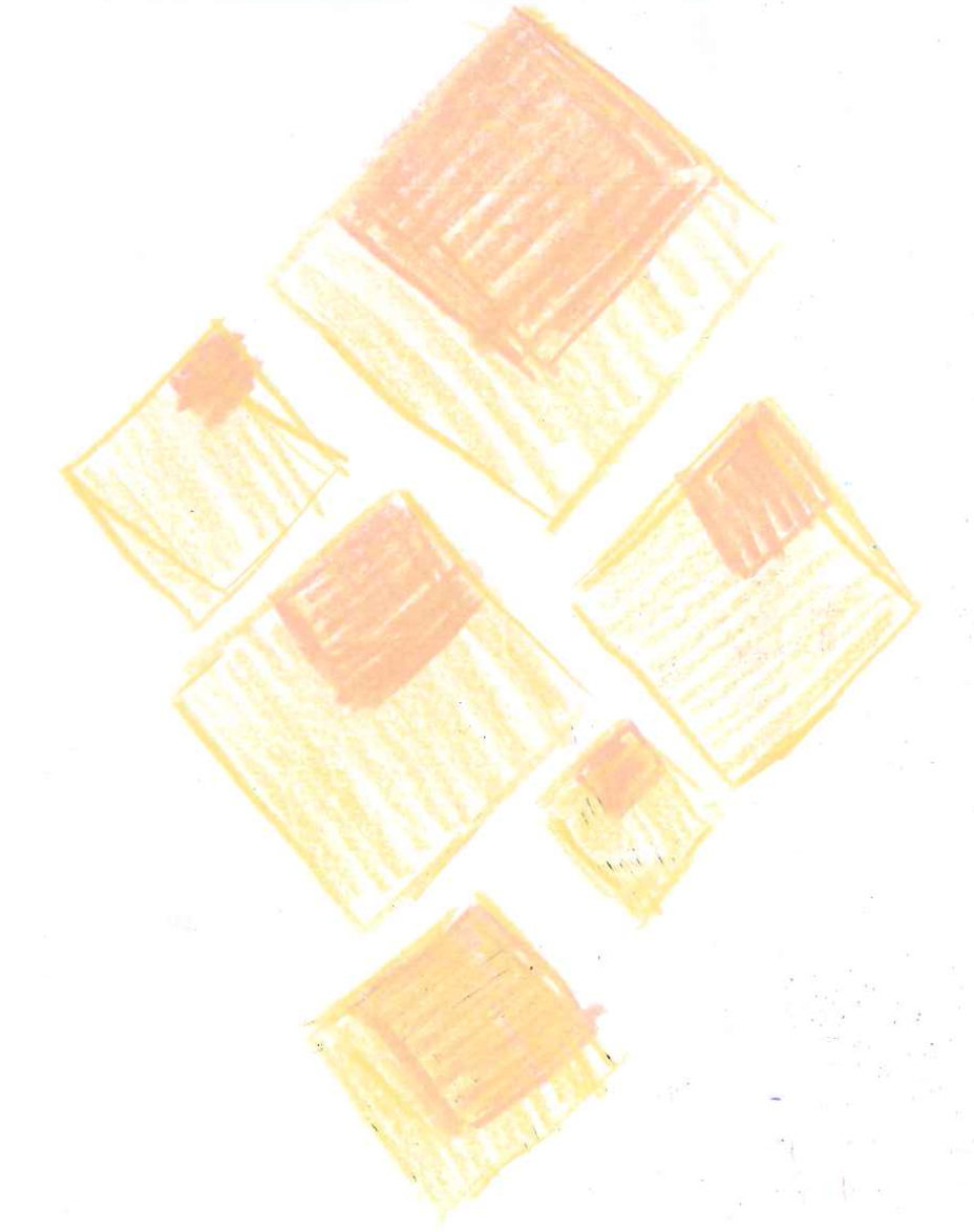
I realized however that the proportional area chart would erase the representation of not as frequently occurring institutions. While on one hand it is helpful to see immediately what is the most represented, what is not represented is just as important. Thus, I wanted something that would show the representation of countries represented in faculty education, but also the level of representation of institutions within a country. This made me consider some type of hierarchical visualization.
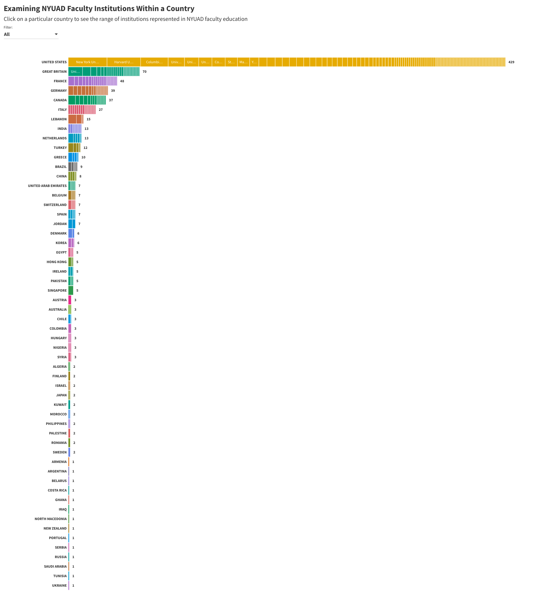
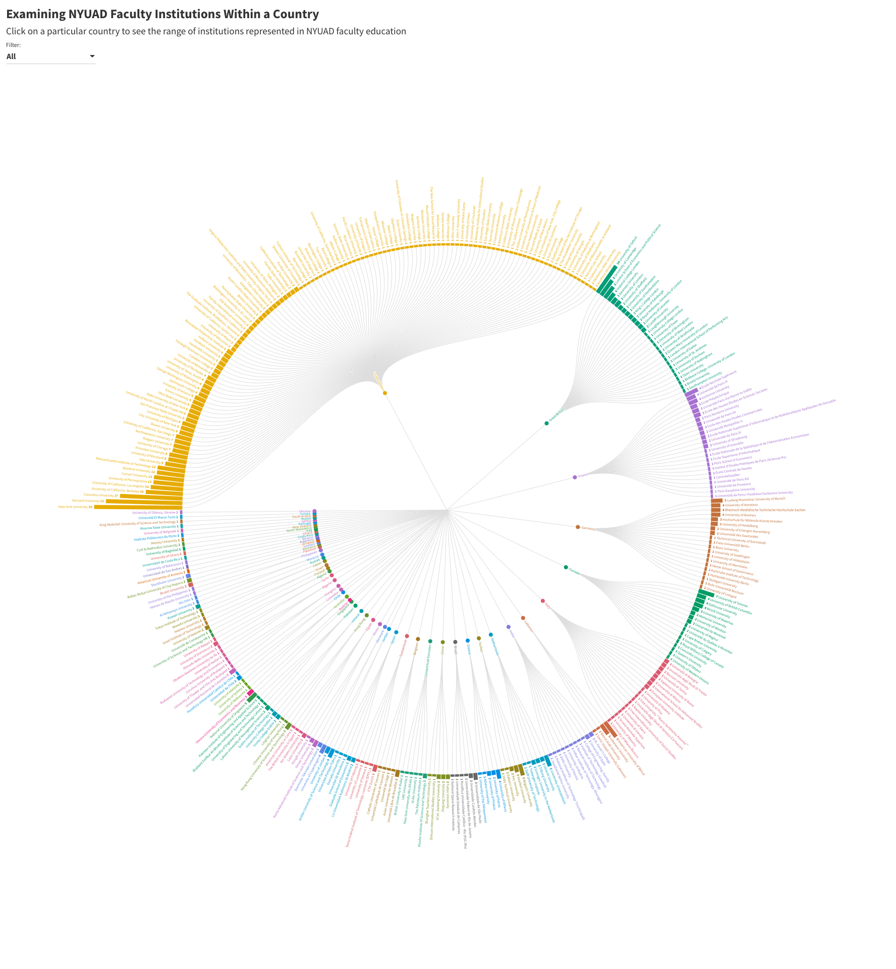
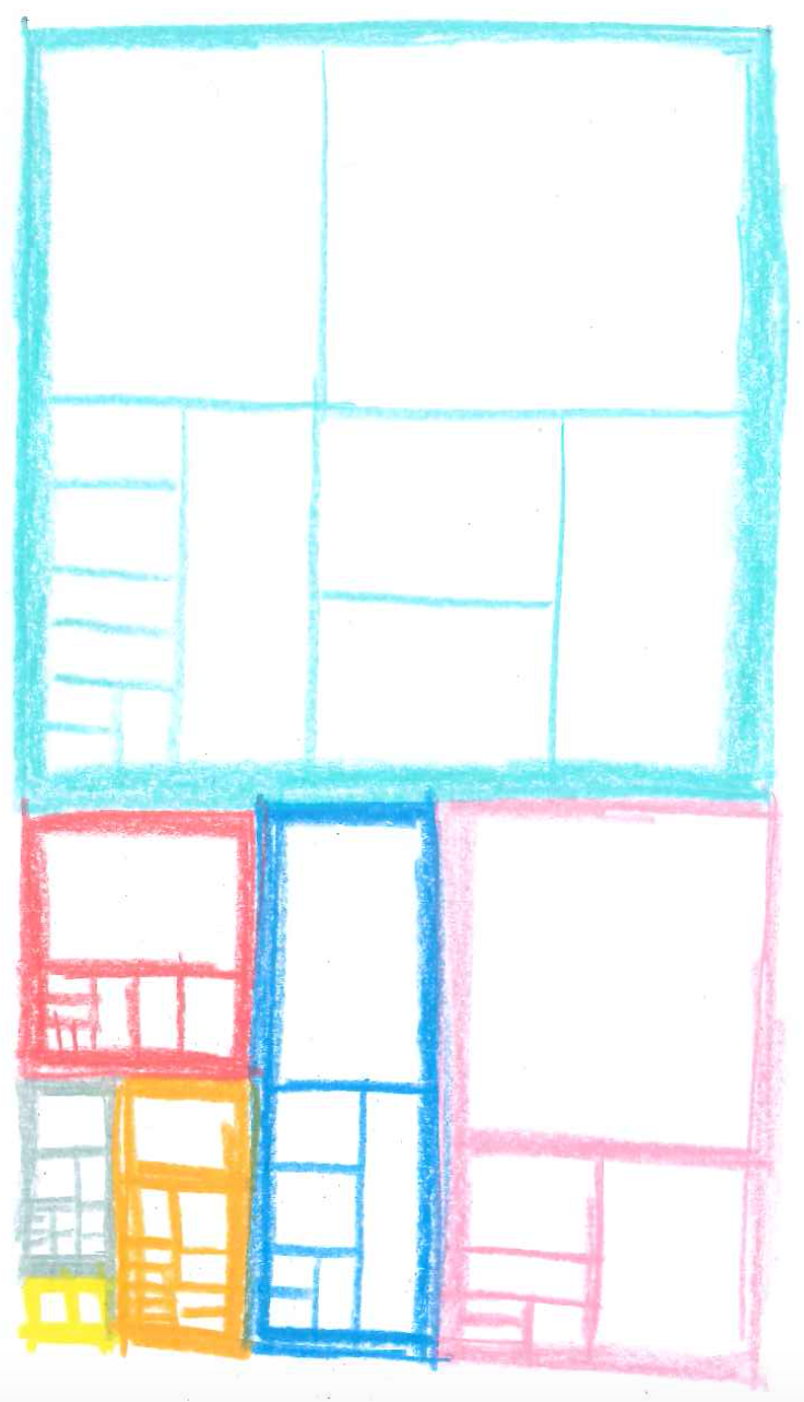
At first, I considered building some sort of bar chart, whether stacked or radial. Neither of them felt very intuitive to me, though I did like how the stacked bar chart really drove the point home of how many faculty degrees were from the United States. The radial one felt difficult to make comparisons on both levels. Thus, I decided to try out a treemap, which I ended up liking quite a bit. It felt right for lack of a better explanation of why I used it.
Piece 4: Documentation
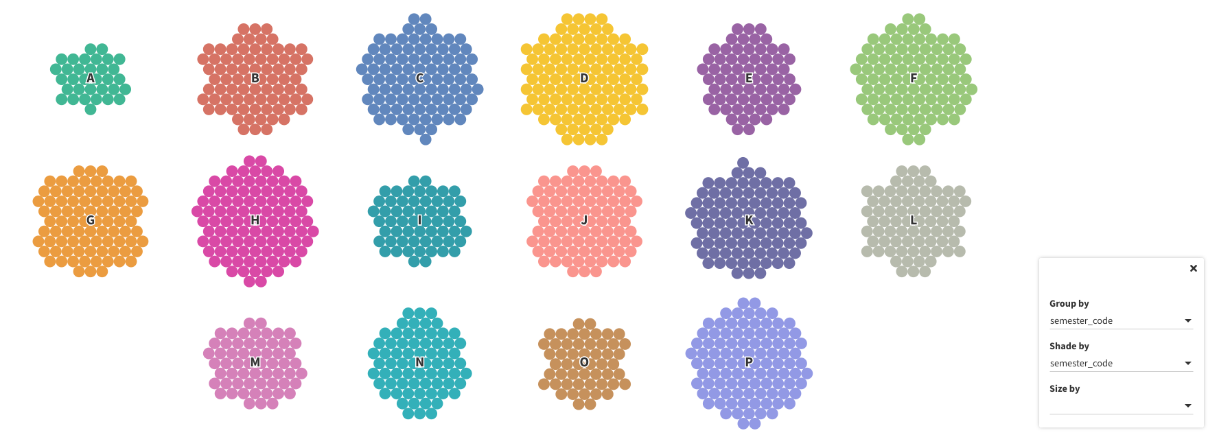
Visualization 1: Packed Circles Diagram
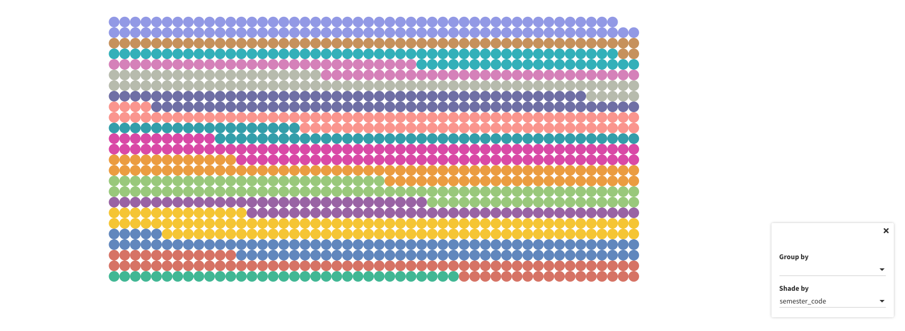
The first visualization aimed to represent the most frequently occurring words in titles of Gazelle articles. Representing text visually is something I find tricky. I find word clouds a bit tacky, but they are the usual go-to for showing the most frequently occurring text. In a previous course project, I used a simple bubble chart to visualize the most followed Twitter accounts of a subset I was studying where the size of the bubble related to how followed the account was. I thought a similar chart would be great for this case; two levels would be needed to represent the semester and the words that most frequently appeared that semester...a packed circles diagram. Originally, we did not exclude any words from the visualization; however, many of the frequent words like "NYUAD" were consistent in every semester, making it difficult to convey any meaning semester to semester. Thus, we decided to remove the words that appeared in every semester as well as prepositions and articles that did not reveal anything about common topics in a particular semester.
Visualization 2: Concentric Dot Visualization
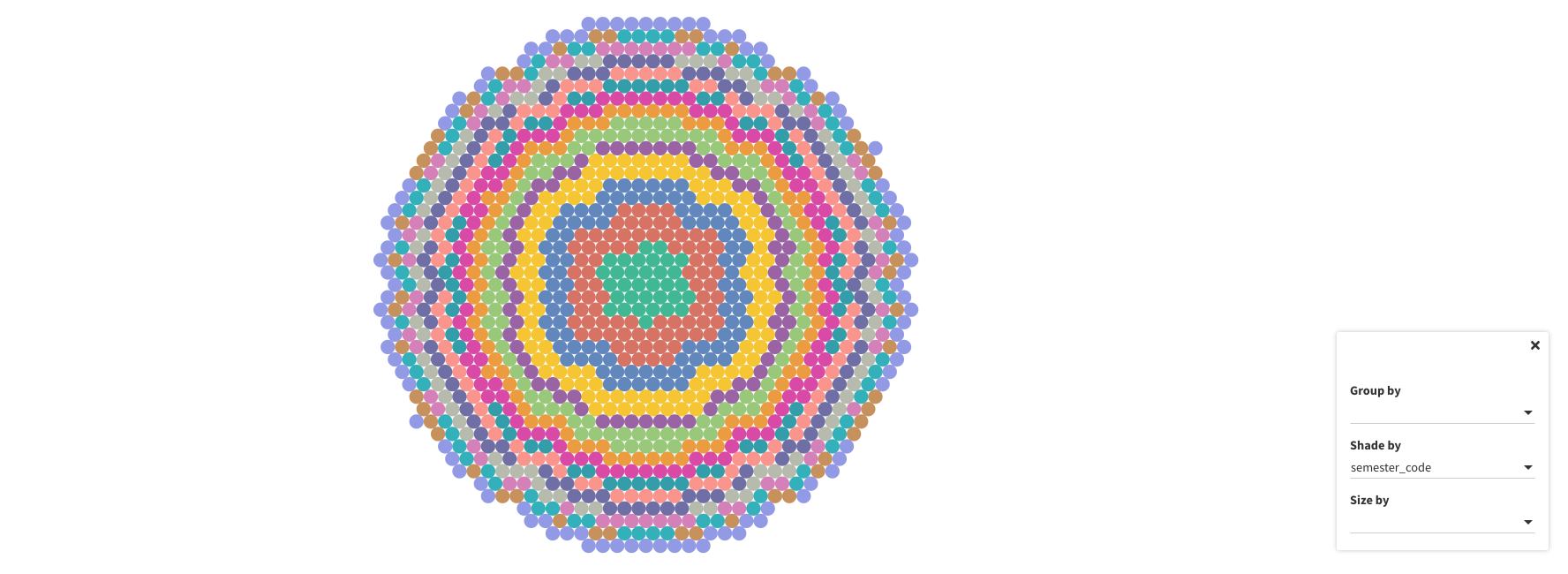
I was really inspired by this dendrochronology (tree ring visualization) of immigration patterns in the US.
I liked the idea of accumulation over time. I thought there was something beautiful about the Gazelle writers all contributing to this unique publication in this unique landscape and wanted to make a tribute to everyone who had contributed. I was also interested in seeing whether there has been a change in the number of writers over time. I played around with this idea of accumulation.
I decided to build a concentric dot visualization to simulate the growth of the Gazelle writer contributions every semester much like the addition of a tree ring each year. Here are some iterations I played around with.
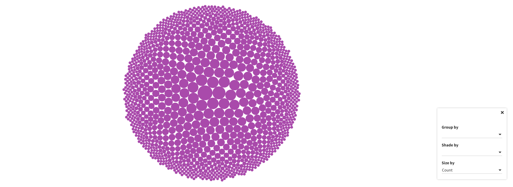
I specifically wanted to also examine the number of unique writers each semester and what proportion of articles are written by the same people -- is the Gazelle made up of the same people writing? I wanted to examine the richness of the publication and the number of diverse voices contributing. Thus, I added a slide that had a bar graph like representation and another that had each semester's writers grouped in a packed circle with the size of the circle representing the number of articles that person contributed.
Visualization 3: Radar Chart
I played around with different ways to represent the age composition of The Gazelle's readership.
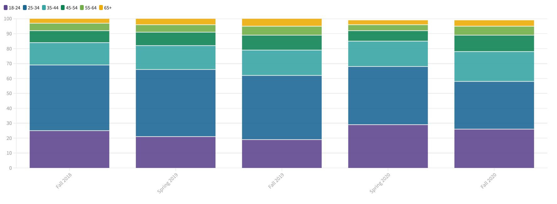
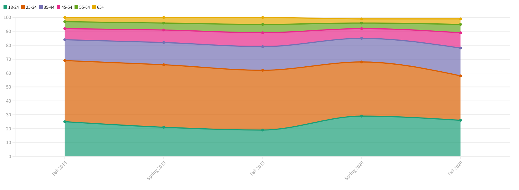
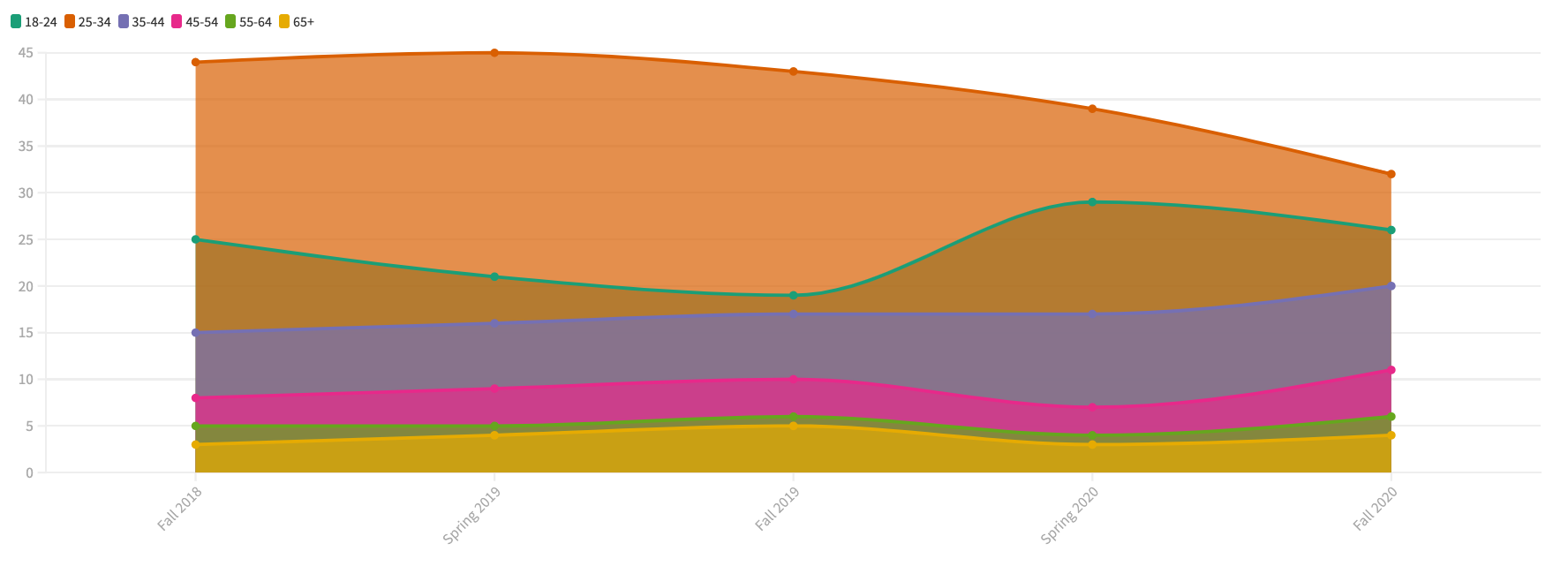
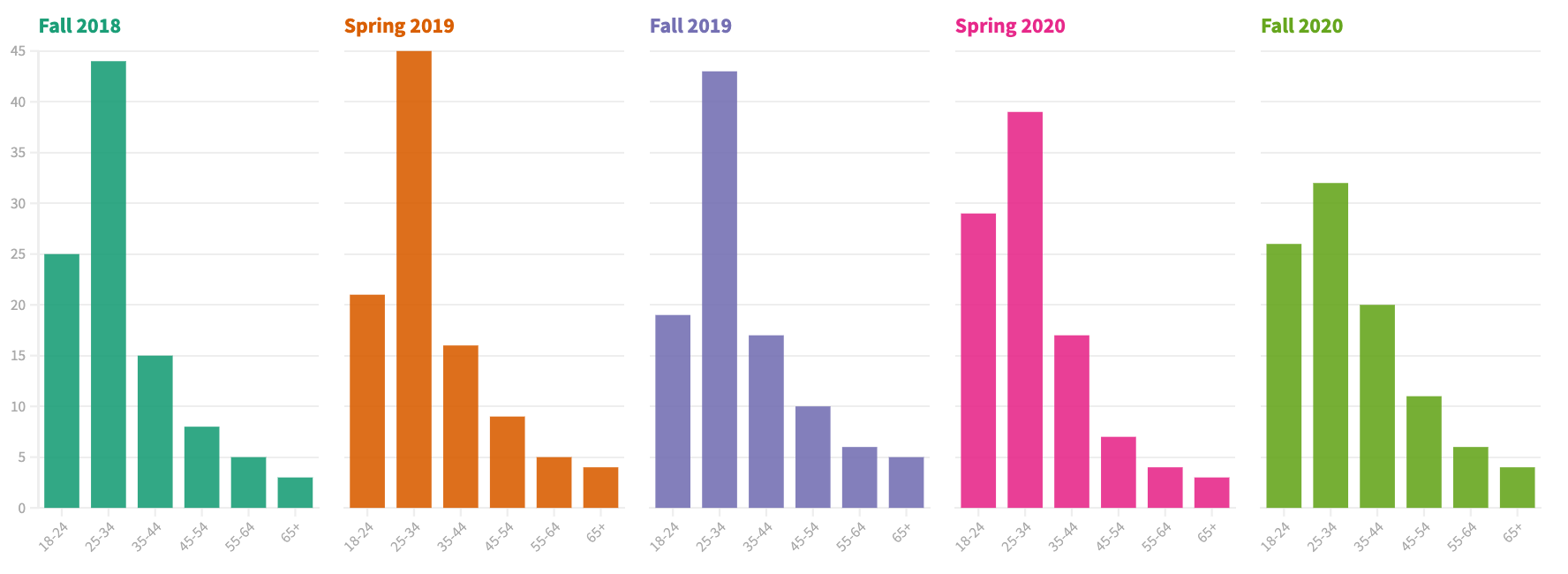
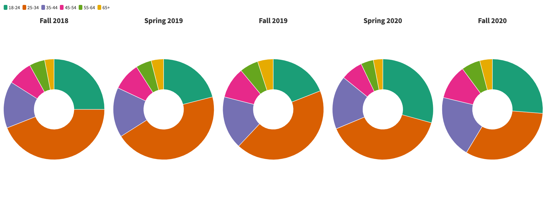
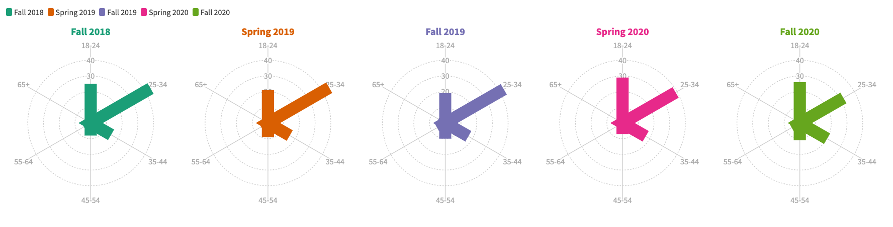
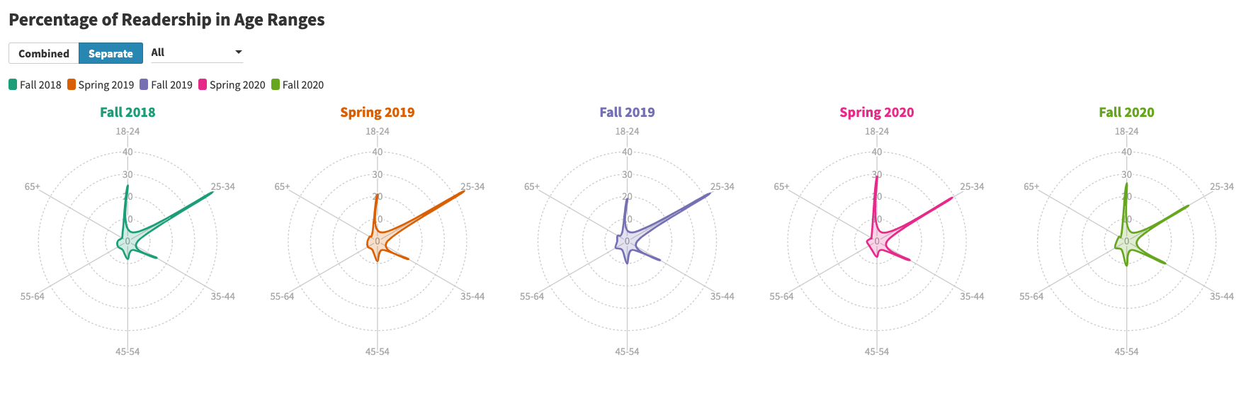
I also considered doing a population pyramid with a dropdown to select two semesters, but that would limit comparison to two semesters. I liked the radar chart because it seemed to facilitate comparison the easiest. I liked how there was also the option to stack the radar charts on top of each other for even clearer comparison. I also wanted to try to use unique visualizations as a way of increasing community members' ideas of what data can like beyond the usual bar charts/pie graphs. Color testing passed.
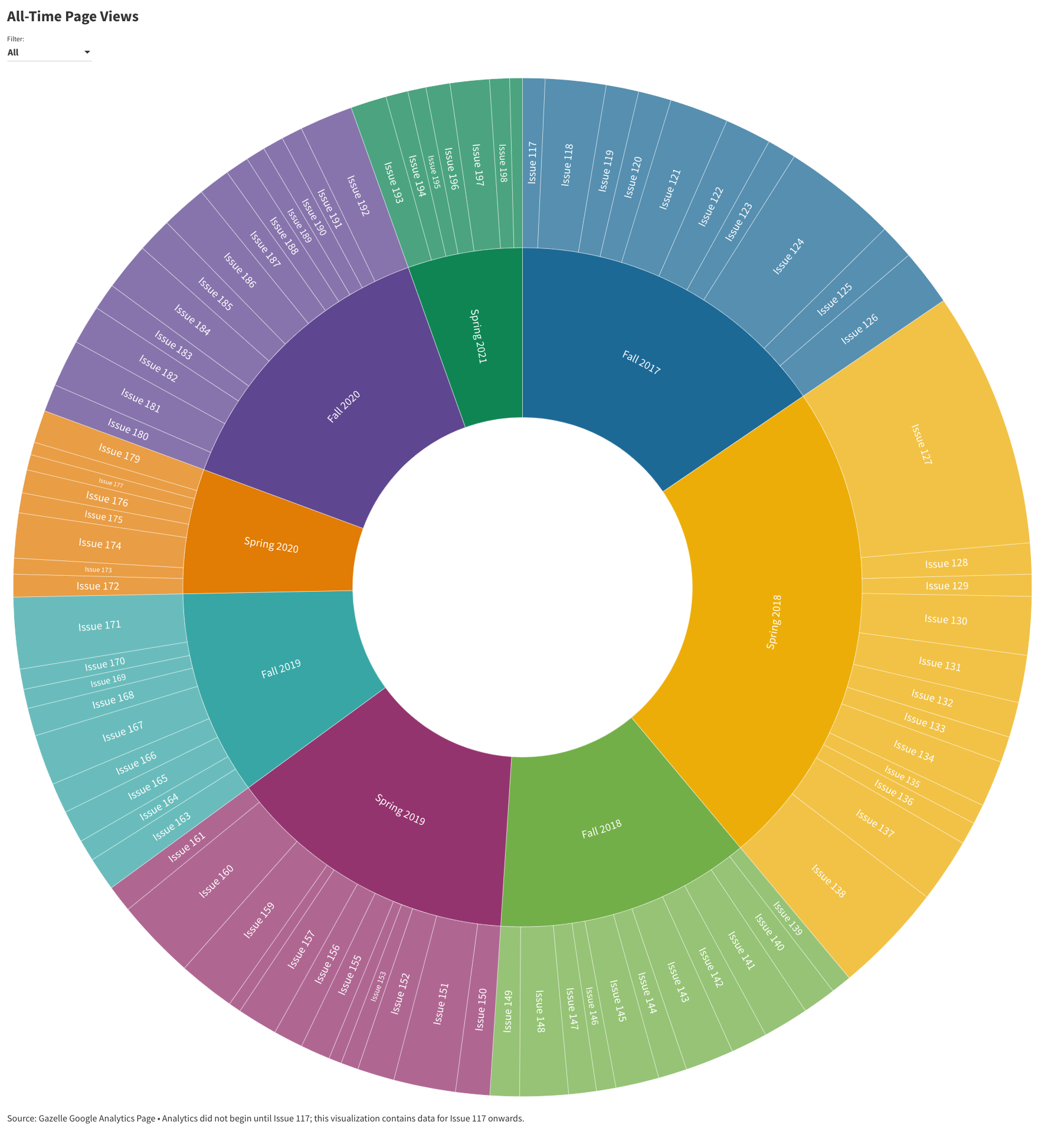
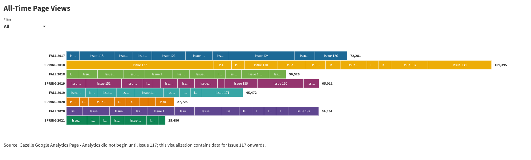
Visualization 4: Radial Tree
I knew from the start that I wanted to do a radial tree visualization to show the page views. It would have the ability to compare quantities like a bar chart but had the added benefit of being able to visualize multiple levels of quantities and also fit the large sample size. I wanted something that would visualize all the issues as a testament to the presence of the publication. Though I knew I wanted a radial tree, I did play around with a few other visualizations.
Piece 5: Documentation
Visualization 1: Population Pyramid
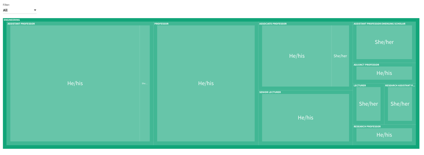
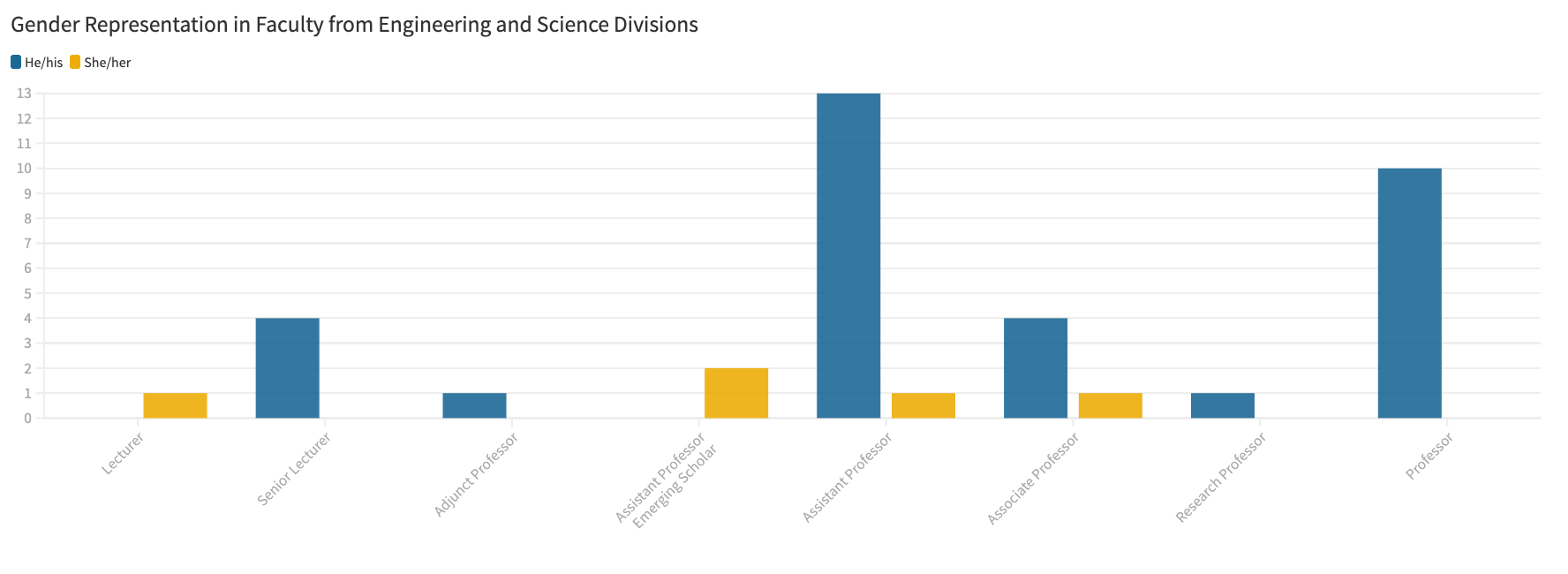
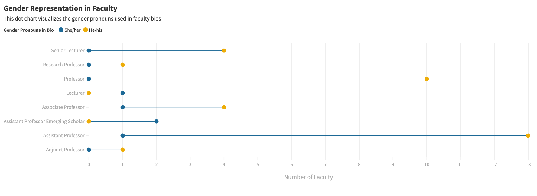
The first visualization aimed to represent the gender representation in engineering and science faculty. I found this difficult to visualize given the absence of female faculty in certain categories. I wanted to make sure to stay away from colors that uphold the gender binary (male=blue, female=pink/red). Here are some of my experiments with building this visualization such as a tree map, connected dot chart, and simple column chart. Color testing passed.
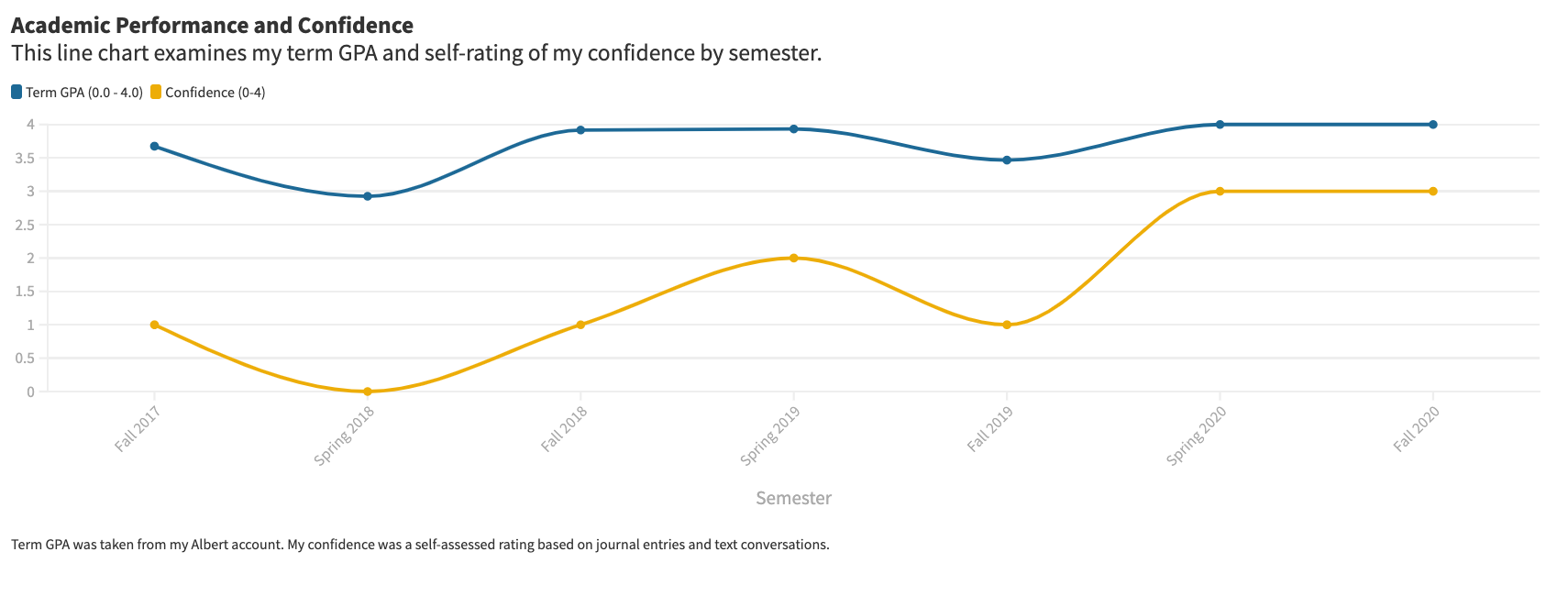
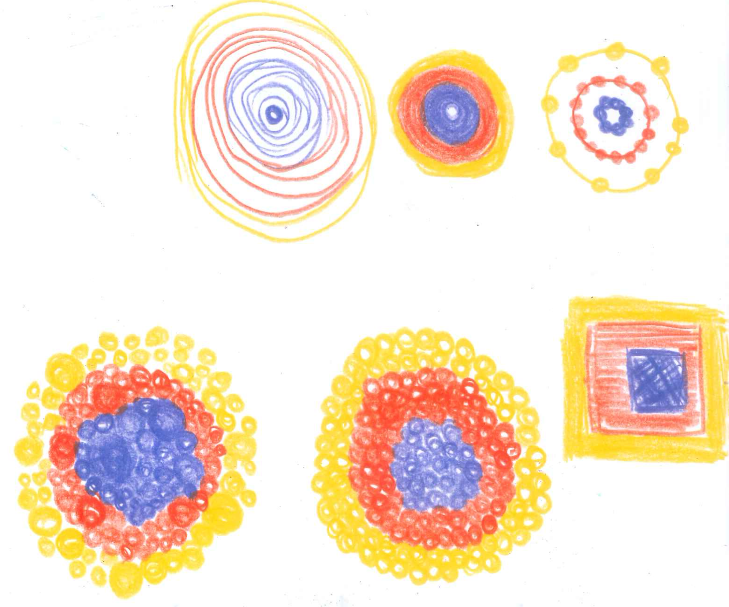
Visualization 2: Working with Personal Data
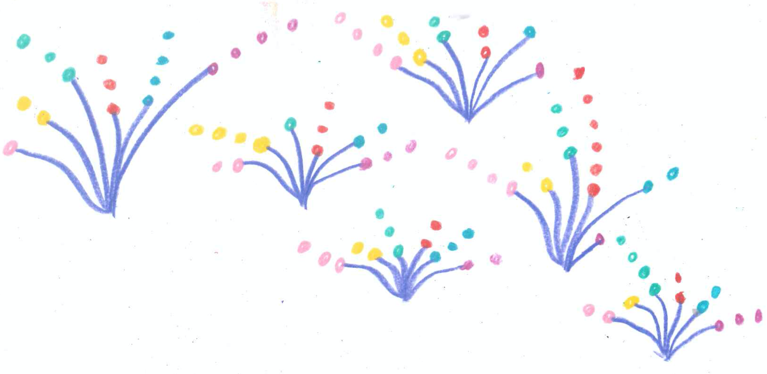
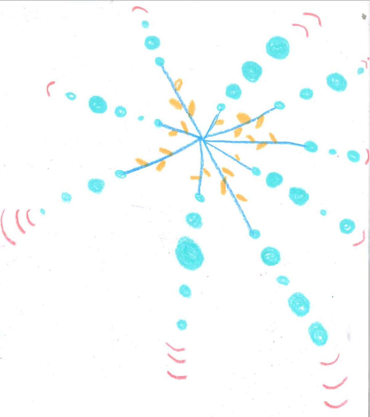
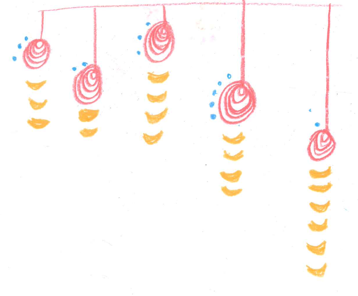
In this visualization, I wanted to convey how being underrepresented in STEM can affect various aspects of your education/NYUAD experience. I first began with a line chart showing my academic performance and self-rating of confidence, but realized that I probably need to build something more abstract to match the human nature of the data. I began sketching with various shapes.